When it comes to selling your products or services, a testimonial page is one of the most powerful components you can include on your website. Of course, persuasive copy and detailed use cases have their place, but nothing encourages people to check out your brand more than happy customers singing your praises.
Getting great testimonials can be tricky, and many businesses find displaying them even harder. What form should they take? Which customers should you include? How should you organize them?
But there’s no need to fret — we’ll walk you through the best testimonial page designs so you can create an awesome one of your own.
Why testimonials are essential
Before we look at what makes a great testimonial page, let’s take a second to recap why testimonial pages and customer reviews are important.
First, unlike the rest of the marketing messages on your website, testimonials come from an unbiased source. Since they aren’t written by someone on your payroll, they carry much more weight with potential customers.
Second, testimonials allow potential users to put themselves in the shoes of your customers. If they work for similar companies and have similar problems, they’ll feel a lot better about working with your company just by knowing you’ve been there, done that, and have the testimonial to prove it.
Ultimately, testimonials help remove the risk from making a purchase, writes María Bustillos, content coordinator at hosting solutions and cloud services provider HostPapa. No one wants to be the guinea pig for a new product.
“A testimonial makes the product a less risky purchase for your new buyers,” she writes, “because it reassures them that your product is ‘tested,’ ‘works great’ and, therefore, is safe to buy.”
What great testimonial pages have in common
Testimonial pages can take many forms and include quotes, blog posts, videos, and case studies. There’s no right or wrong way to design yours, but all of the best testimonial designs share a few key characteristics.
They look great
You want potential customers to spend time reading your testimonials, right? The first step is to make your page visually appealing. High-quality imagery does more than just make your page look pretty; pictures improve the impact of your testimonials too.
Including images of your customers is incredibly effective, writes Gregory Ciotti of Shopify. “Hearing from another customer goes a long way,” he writes, “but seeing a real person alleviates the nagging feeling that the high praise they’re reading is falsified or exaggerated.” What’s more, he adds, research shows photos make these kinds of statements more believable.
They include specific testimonials
While it’s certainly true that the more testimonials you have, the better, it’s worth highlighting those that mention a specific feature of or use case for your product. Specific testimonials may speak directly to fewer readers, but they’ll be much more powerful when they do hit home.
They keep testimonials authentic
It can be tempting to clean up your customers’ testimonials to make them read better. Don’t.
Andy Crestodina, cofounder and strategic director at Orbit Media Studios, says it’s “virtually impossible for a marketer to write copy as authentic as a customer.” Keep testimonials in your customers’ voice — that means capital letters, typos, warts, and all.
3 awesome examples of testimonial page designs
If you’re looking for inspiration to create your own testimonial page design, check out these three great-looking and highly effective examples.
Slack
Slack’s testimonial page makes good on its promise of helping teams work better. The company shares ample case studies that detail exactly how Slack has improved operations in a wide variety of businesses, and it includes quotes from executives.
Flatiron School
Coding bootcamp Flatiron School isn’t trying to attract customers; it wants to recruit new students. That’s why its testimonial page is focused on the many and varied success stories of recent graduates.
The page does a great job of including alumni with vastly different backgrounds to make it much more likely for potential students to see something of themselves in one or more of the graduates. If prospective students want to learn more, they can read a full-length blog post that details each alum’s experiences.
Buffer
Buffer’s testimonial page is an excellent example of how powerful it can be to let customers speak for themselves.
The company provides proof in the form of a dozen or so social media mentions from customers expressing delight at the product, which are embedded on the page. And Buffer backs them up with pull quotes from top-level marketing figures at major companies explaining the kind of transformational impact Buffer has had on their business.
Create a testimonial page with Jotform
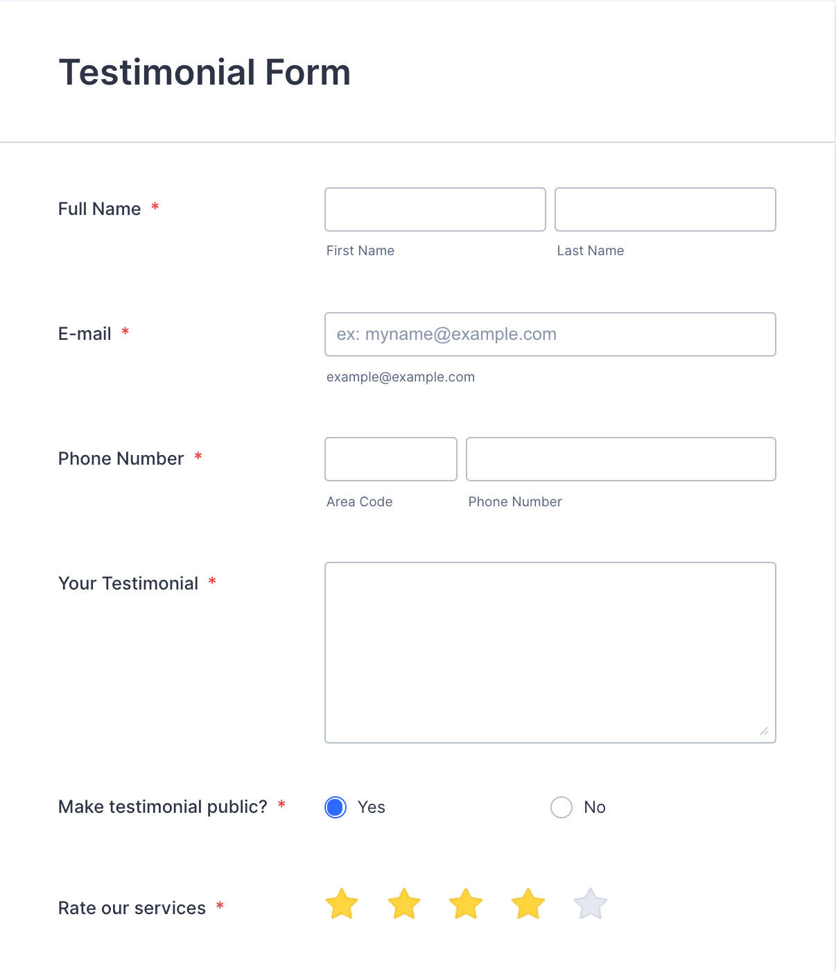
Jotform makes it easy to gather and display testimonials. Use the testimonial form template to collect reviews from your loyal customers and store their feedback in a Jotform table. From there, you can embed every response or a select few for your website’s testimonial page. Because the table updates when new testimonials are submitted, you’ll always have a fresh set of reviews on your testimonial page.


Send Comment: