Are you ready to turn your website visitors into promising leads? A landing page can help you do just that. In this post, we’ll talk about what a landing page is and the best practices for designing one. If you want to create an amazing landing page, keep reading.
What is a landing page?
The most important page of your website, the landing page is the first page your visitor sees. It’s the make or break factor, determining whether your visitor bounces or whether they convert into a lead.
Why do you need a landing page?
A new visitor to your site might get distracted by all you have to offer. You want them to stay focused on taking the desired action, whether that’s signing up for a free trial, joining your newsletter, or creating an account.
A landing page helps your visitors stay focused.
Best practices
Let’s start with the basic components and best practices of designing a landing page.
Have a clear call to action
Within the first three seconds of visiting your page, your visitor should know what you want them to do. Would you like them to enter their email? Sign up for your free trial or free account?
In order to do that, you need to…
Make sure the call to action is above the fold
Visitors shouldn’t have to scroll to see your call to action. It should be right in front of them when they first land on the page.
Take, for example, Shopify’s landing page:
- The page is clear and concise.
- Two identical green buttons prompt visitors to “start free trial.”
- Pricing is prominently displayed for anyone who’s curious.
- A Learn dropdown appears in the top navigation for visitors who want to learn more about Shopify.
Display help resources and contact information prominently
How can your visitor contact you if they have questions? Where can they find answers?
Your visitor should be able to easily find contact information and/or answers to their questions. This can be an FAQ page, a help center, a Contact us button, a contact form, an email address, or a contact number.
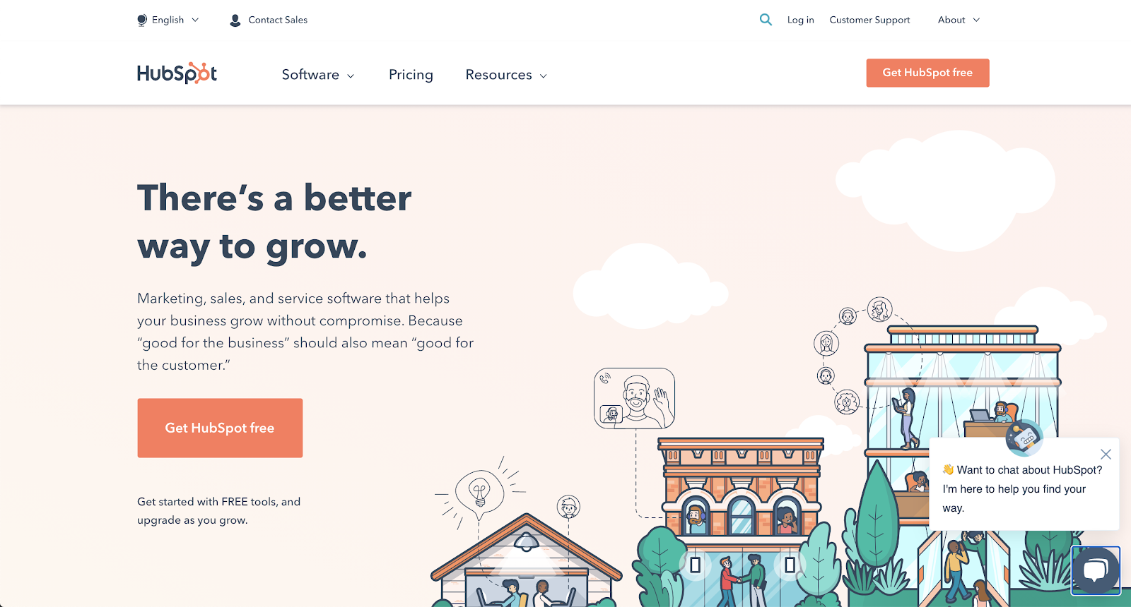
HubSpot displays its Contact Sales and Customer Support links in the header of its landing page.
Design and write copy using principles from psychology
1. Reciprocity
If you offer something to your visitors, they’re more likely to support your business. This is why many landing pages offer free online resources in exchange for a visitor’s email address.
You could offer a free trial of your service to give your visitors a taste of what you provide. This also helps lower the barriers to entry, because visitors are more likely to sign up for a free account than a paid account right off the bat.
2. Commitment and consistency
Make sure your tone of voice is consistent throughout your messaging. For example, if you adopt an informal tone of voice, make sure you use the same informal tone throughout your website.
3. Social proof and authority
As social creatures, we tend to prefer things that other humans have already tried and liked. This is why every good landing page always has a section that highlights existing and past customers.
We’re more likely to be persuaded by people who appear satisfied. A photo of a happy customer or a glowing testimonial may help increase your landing page’s conversion rate.
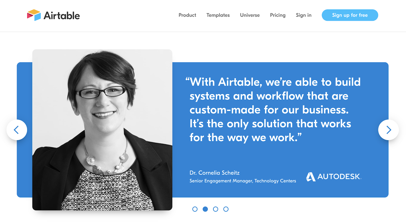
Airtable does this by displaying reviews from smiling people on their landing page.
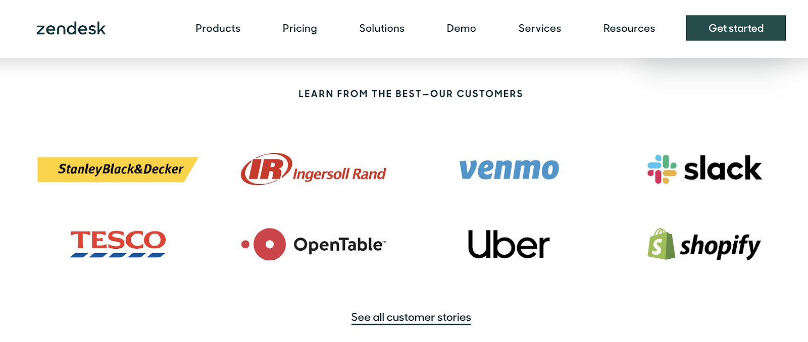
Good landing pages list well-known companies in their current/past customers section. Showing your visitors that reputable companies trust you, makes it more likely that they will trust you too.
Like Airtable, Zendesk displays a few of its prominent customers. There’s also a link to its customer stories page, where visitors can read about other customers’ experiences and find out why those customers chose Zendesk, why they stay, and what they enjoy about the product.
What if you’re a new company and don’t have clients yet? Offer your services to friends, family, or local businesses, and gather a few testimonials to add to your landing page.
The process of designing a landing page
Wireframe and prototype your design
Before you start designing your landing page, it helps to create a wireframe that shows where your major components will go.
This will save you time. Instead of creating intricate designs that don’t optimize your visitor’s user experience, and that you have to go back and edit later, you can design the right elements the first time.
We’ve got a list of free wireframe resources you can use.
Test your design
A/B testing
In A/B testing, you show half of your visitors version A, and the other half version B to see which version performs better. Then you tweak and try again. It’s best to base changes on real user data. Your findings may surprise you.
For example, Signal V. Noise conducted an A/B test on a marketing page. There was a 105.2-percent increase in conversions for the page that featured a smiling person.
You can easily A/B test web forms with JotForm.
User testing
Talk to real users and get their feedback. What may seem simple to you may not be simple to them. Watch their reactions and responses, and ask for their opinions. Then tweak your landing page based on the data you collect.
And if you find yourself in the midst of a deadly pandemic, you can still collect user feedback remotely via Zoom, user testing software such as Marvel, or other videoconferencing software that allows you to share your screen.
Use our handy-dandy user testing survey template to collect answers from your testers.
Optimize your page for search engines
Good search engine optimization is crucial for any website, landing pages included. When optimized for SEO, your website will appear higher in the rankings of search engines like Google. You want to be as close to the top as possible, so it’s wise to invest in SEO optimization.
Check out our SEO guide for more information about how to utilize SEO for lead generation.
Conclusion
A good landing page requires patience, careful research, and lots of testing. When done right, you can sit back, relax, and enjoy the fruits of your labor in the form of more conversions!


Send Comment: