You’ve had a long day at work.
Tired and hungry, you meet an old friend for a drink. The next few minutes might sound something like this:
“Come and sit down. How was your day?”
“Crazy! Seven meetings, everyone’s really stressed.”
“Why’s that?”
“We’re launching the new version tomorrow, and there’s still tons to be done.”
Short, simple sentences. Everyday words. Easy turn taking. Questions and answers.
That’s how humans talk.
That’s how conversations work.
But when the conversation takes place online, we can’t see the other person or hear their voice. Erika Hall, the author of Conversational Design, explains:
“When it comes to designing digital systems, there is always a risk of forgetting there will be humans involved and, as a result, making things more robotic than realistic.”
Long paragraphs. Precise grammar. No contractions.
Rather than saying:
Please answer the questions below.
an online form might start with:
It’s essential that you read, fill out and complete answers to the questions in the following sections contained in the form on this and the following pages.
This kind of writing is pretentious. It alienates readers. Plus, it’s a nightmare to read.
The alternative? Writing how you talk: a dialogue (not a monologue).
Elmore Leonard put it well when he remarked:
“If it sounds like writing, I rewrite it.”
Funnily enough, it’s much harder to write like a human than a robot — but it’s so worth it. When the conversation feels warm, straightforward and real, it will forge connections and make an impact.
Here’s how.
Pro-Tip
Build forms people will actually fill out with Jotform! Our easy-to-use Form Builder offers form fields and layout options designed to boost engagement.
First things first
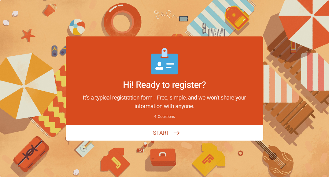
Say hello
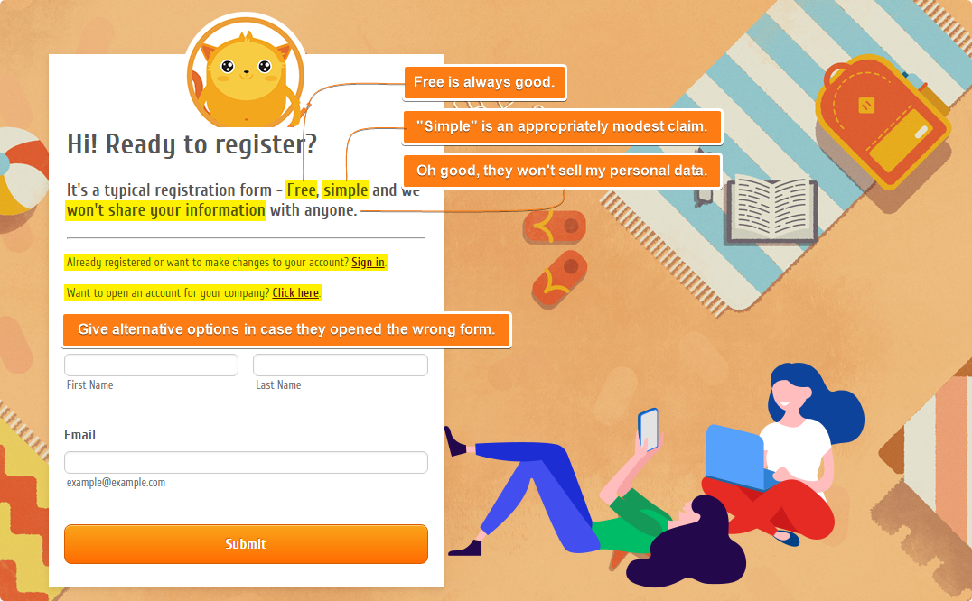
I know, that seems so obvious! But you’d be surprised at how many online conversations don’t start with a greeting.
We know good manners matter: that’s why Jotform Cards has a customizable welcome page in-built for instance.
Next, the title. It should reflect the form’s purpose without stating the obvious: i.e., the word ‘form’ doesn’t need to be in there.
If necessary, include a list of things to gather here: we don’t want users to be scrambling around looking for their passport halfway through.
Make it personal
Talking to strangers generally doesn’t appeal, particularly online. So let the person you’re talking to know a bit about who you are with a (brief) summary statement.
That sense of a real-life, two-way conversation can continue throughout the form. Use pronouns like “I,” “you” and “your” to make it a little more personal.
Eliminate passive
Writing is clearer and more impactful when it’s active (The customer must fill out the form) rather than passive (The form must be filled out by the customer).
Active verbs make a text more concise, because they are shorter than passives. They also make it more dynamic because they focus on the action, and more accurate because they identify the subject of the action described. Non-native English speakers find active sentences easier to understand.
Passive writing confuses as it tends to be lengthier and less focused.
How can you tell if a sentence is passive? Here are two giveaways:
– The subject doing the action is unclear (John was driven to the cinema. )
or
– The sentence uses the verb ‘to be’ (has been, was…).
The active voice closely resembles the human language. When we speak, we use the active voice without thinking about it.
Still in doubt? You can check for pesky passives with Microsoft Word’s Readability Statistics, or with Purdue’s Paramedic Method.
Use headings for focus
“On the average, five times as many people read the headlines as read the body copy” — David Ogilvy
It would be lovely if people read forms with their 100% undivided attention.
But they don’t.
They skim and speed-read the content that is relevant to them, and ignore the rest (80% of it, on average).
We can’t stop them, so we might as well guide them: with clear, succinct titles and headers.
Great headers maketh a form: they clarify the text, give it structure and break it down. They also do most of the heavy lifting when it comes to keeping users engaged.
That makes them just as, if not more, important as the questions themselves. Give them careful thought.
A user should be able to glance at a header and gauge what is expected of them. The best way to test this is to read headers in isolation from the rest of the text — do they still make sense?
Don’t make false promises
Is your form a breeze to complete? Let users find out for themselves. Claiming how ‘quick and easy’ it is, or giving a time estimate, is a waste of text.
People write, and read, at different paces. Don’t risk undermining anyone’s ability.
But if your form is guaranteed to take hours? Give people some warning.
KISS at all times
You’ve heard about the KISS principle: Keep It Short and Sweet (or, somewhat less sweetly: Keep It Simple, Stupid!)
KISS is the queen of forms.
And the best way to KISS is through the Cs: Cut, Condense, Contract, Cleave.
“Look for the clutter in your writing and prune it ruthlessly. Be grateful for everything you can throw away. Reexamine each sentence you put on paper. Is every word doing new work? Can any thought be expressed with more economy?”
― William Zinsser, On Writing Well: The Classic Guide to Writing Nonfiction
Cut
Writers often feel that the more words they use, the more they will impress their readers. The opposite is true. Many forms use more words than is necessary, and which creates noise that makes it harder for the reader to focus on key content.
That means things like jargon.
Jargon is technical or snazzy terminology for the sake of it. It isolates, it confuses; in fact, it achieves the opposite of good communication.
But what constitutes jargon depends on who you’re talking to one person’s jargon may be another person’s shortcut to clarity. If a specialist term is bread and butter for your audience and offers a concise way of expressing complex meaning, then using it makes sense — and it stops being jargon.
When it comes to cutting, your guiding principle is relevant meaning. A text transforms after being combed for redundant words, emerging leaner and more precise.
To tighten, remove the following:
- Adverbs (words ending in -ly).
- Meaningless qualifiers (a lot, a great deal).
- Empty intensifiers (very, quite, rather, really).
- The word ‘that’.
- Nonessential information.
- Vague words (thing, few, many).
Condense
In grade school, we were rewarded for using difficult words. In college, we assumed we’d be taken more seriously with long, familiar words of Latin or French origin.
So, it’s no wonder these kind of sentences crop up all the time:
“Kindly accept our sincerest apology. Nevertheless, we would care to know your opinion. Furthermore…“
Sounds stuffy and unnatural, right? This lingo might work in academic essays, but it jars in ordinary conversation. It also creates a certain distance — as if we are looking down on our readers.
The good news? We can make life easier for ourselves, and our writing more engaging, by using the simplest version of every word.
‘Plain English’ words are clearer and more precise than their more elaborate or ‘fancier’ alternatives.
So if you mean ‘end’, don’t say termination. There’s nothing to be gained by substituting ‘utilize’ for ‘use’.
Contract
Cannot or can’t? It is, or it’s? You will use full forms (without the apostrophe) when you want to be formal, will you not?
But if you’re going to keep your style conversational and relaxed, then it makes sense to go for contracted versions, doesn’t it?
What’s your home address > What is your home address?
Easy peasy.
Cleave
Lengthy, dense sentences, overly-crammed with adjectives; too much punctuation; and, meandering, split logic — they create overwhelm, don’t they?
Ditto big blocks of unbroken text.
It’s like having to swallow too much food in one go. Let’s call it reading indigestion. You don’t want to make your readers sick. Bite-size is always better.
So here’s an imaginary ax. Take it and start cleaving long blocks of text in two. For most readers, up to 20 words per sentence is comfortable.
Three sentences per-paragraph maximum. Don’t be afraid of sentences that only contain a couple of words. White space, bullet points, and tables are your friends.
Brevity is a blessing.
And finally…
Say it out loud
It’s the oldest trick in the book for a reason — it works.
Read what you’ve written aloud. Do it often. Say it loud (don’t mutter it under your breath).
Listen to yourself. Does it sound like something you’d say to a living, breathing human? No? Change it.
Come back to it
It’s true that good writing is 30% composition, 70% editing. Put the form away and return to it in a few days. You’ll spot errors you missed the first time and ways to clarify it further.
Edit. Rewrite. Repeat.
Keep it light
Think back to that imaginary conversation with a friend. Why do you enjoy chatting with them?
It’s the small mannerisms and jokes that make it feel personal.
In a world full of meaningless digital interactions, we crave connections that feel a little more human.
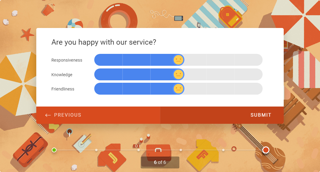
And when you sprinkle a little bit of personality over what you create, your users get to know you: like the Jotform Cards Emoji Slider.
Users should experience your writing like a warm conversation over a cup of coffee.
So be yourself. Cut out the noise and go back to the basics. Brew something to drink, offer your readers a slice of homemade cake, and have a chat.


Send Comment:
1 Comments:
More than a year ago
Hi, how are you? I just wanted to say thanks for this interesting and useful blog. I'm working on creating a Jotform for a non-profit organisation I volunteer for.