Most people think of a yogurt brand when they hear, “Swiss style.” As designers, we may be a bit more familiar with the Swiss school of design. Some call it the evolution of modern design. Others may think of it as just a step to where design style is now. Both may be correct.
Josef Müller-Brockmann (May 9th, 1914 – August 30th, 1996) is considered one of the key players in the Swiss School of international Style. When one considers the time of his career, which included the Second World War, the Cold War and the growing influence of a Europe on the mend from destruction and fear, he certainly influenced not only a design style that influenced designers on a global scale. It was a time of rebirth for many nations that lay in ruins, rebuilding and rethinking centuries of tradition that were forced to change due to the brutality of war and cruelty.
Müller-Brockmann was more than just a man who sought to form what is now labeled the Swiss School; Constructivism, De Still, Suprematism and the Bauhaus, all of which pushed his designs in a new direction that opened doors for creative expressions in graphic design, influenced him. Among his peers he is probably the most easily recognized when looking at that period.
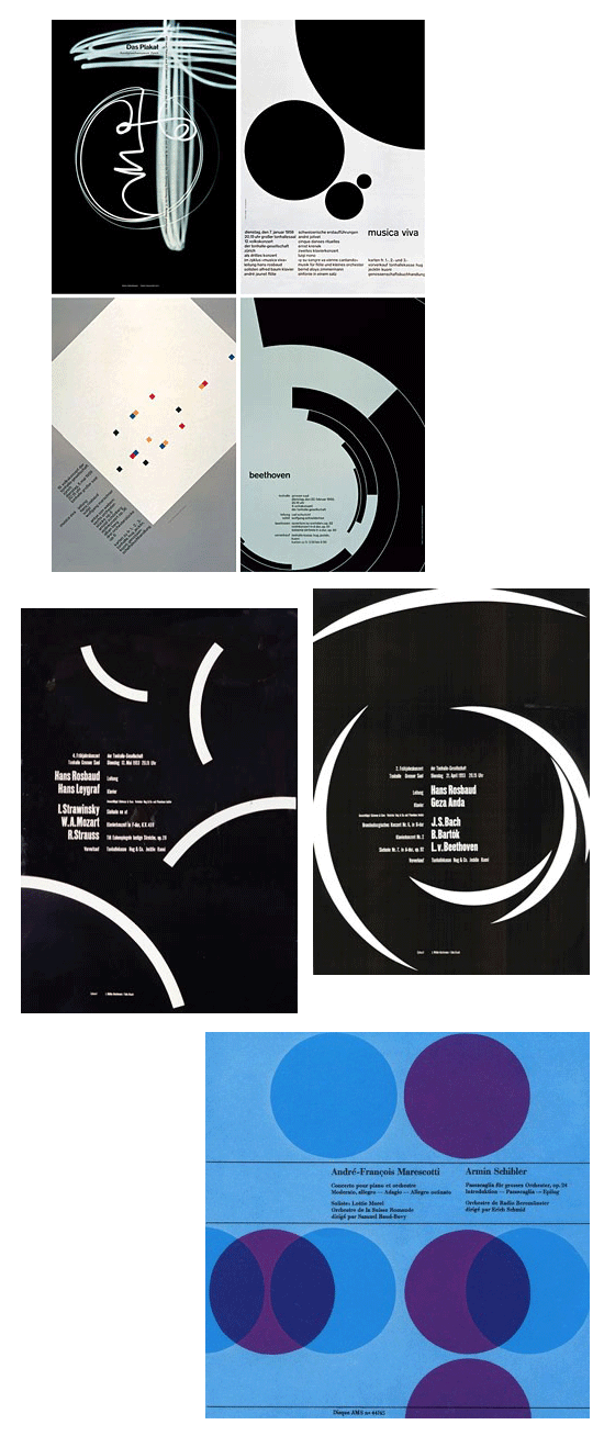
Perhaps his most recognized work was done for the Zurich Town Hall as poster advertisements for its theater productions. The work is graphic, rather than illustrative. Some critics say these posters created a mathematical harmony, which reflected the harmony of music. If one studies posters before that time, they would probably all agree that these are a bold and different way to play to visual messages dealing with music. Who would think of such a graphic? Who would dare execute such work at that time? If you look at the jazz and fusion albums in America at the time, you can see Müller-Brockmann’s influence.
The Grid System: Constrictive Or Freeing?
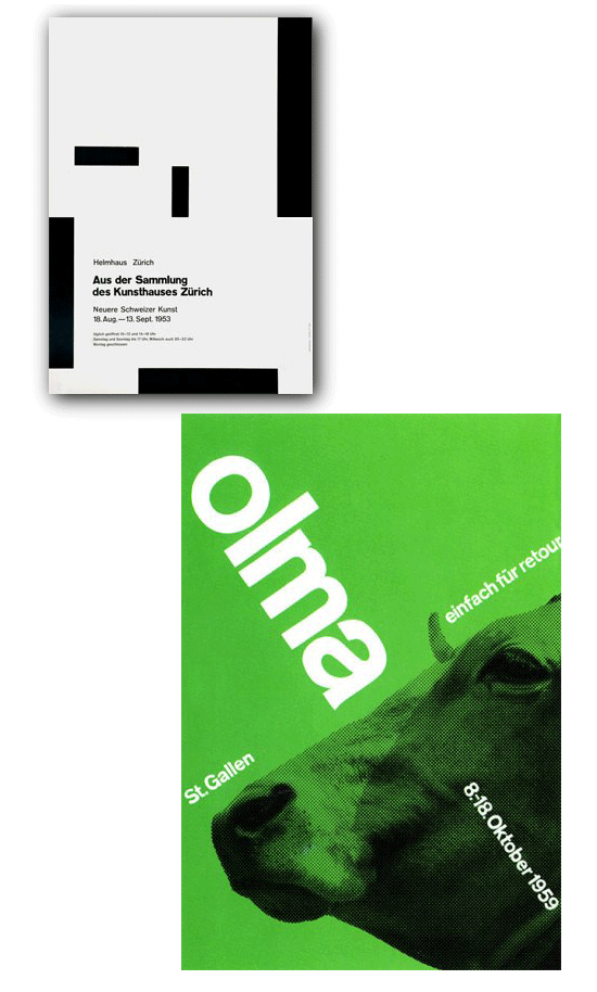
His design sense of the 1950s aimed to create posters that communicated with the masses. This was no small feat as the pieces had to communicate across a language barrier, with English, French, German and Italian speaking populations in Switzerland alone. It was the harmony and simplicity of these pieces that influenced a post-war world that had lost the sense of central nationalism and gained a lesson in the need for globalization. Müller-Brockmann was soon established as the leading practitioner and theorist of the Swiss Style, which sought a universal graphic expression through a grid-based design, purged of extraneous illustration and subjective feeling.
The grid was the prioritization and arrangement of typographic and pictorial elements with the meaningful use of color, set into a semblance of order, based on left-to-right, top-to-bottom. According to Wikipedia, the grid system is, “a two-dimensional structure made up of a series of intersecting vertical and horizontal axes used to structure content. The grid serves as an armature on which a designer can organize text and images in a rational, easy to absorb manner.”
Despite that dry description, the page does go on to add, “After World War II, a number of graphic designers, including Max Bill, Emil Ruder, and Josef Müller-Brockmann, influenced by the modernist ideas of Jan Tschichold’s Die neue Typographie (The New Typography), began to question the relevance of the conventional page layout of the time. They began to devise a flexible system able to help designers achieve coherency in organizing the page. The result was the modern typographic grid that became associated with the International Typographic Style. The seminal work on the subject, Grid systems in graphic design by Müller-Brockmann, helped propagate the use of the grid, first in Europe, and later in North America.”
In an interview with Eye Magazine in the winter of 1995 (a year before his death), Müller-Brockmann spoke about what order meant to him:
“Order was always wishful thinking for me. For 60 years I have produced disorder in files, correspondence and books. In my work, however, I have always aspired to a distinct arrangement of typographic and pictorial elements, the clear identification of priorities. The formal organization of the surface by means of the grid, a knowledge of the rules that govern legibility (line length, word and letter spacing and so on) and the meaningful use of color are among the tools a designer must master in order to complete his or her task in a rational and economic manner.”
The KISS Method (Keep It Simple, Stupid).
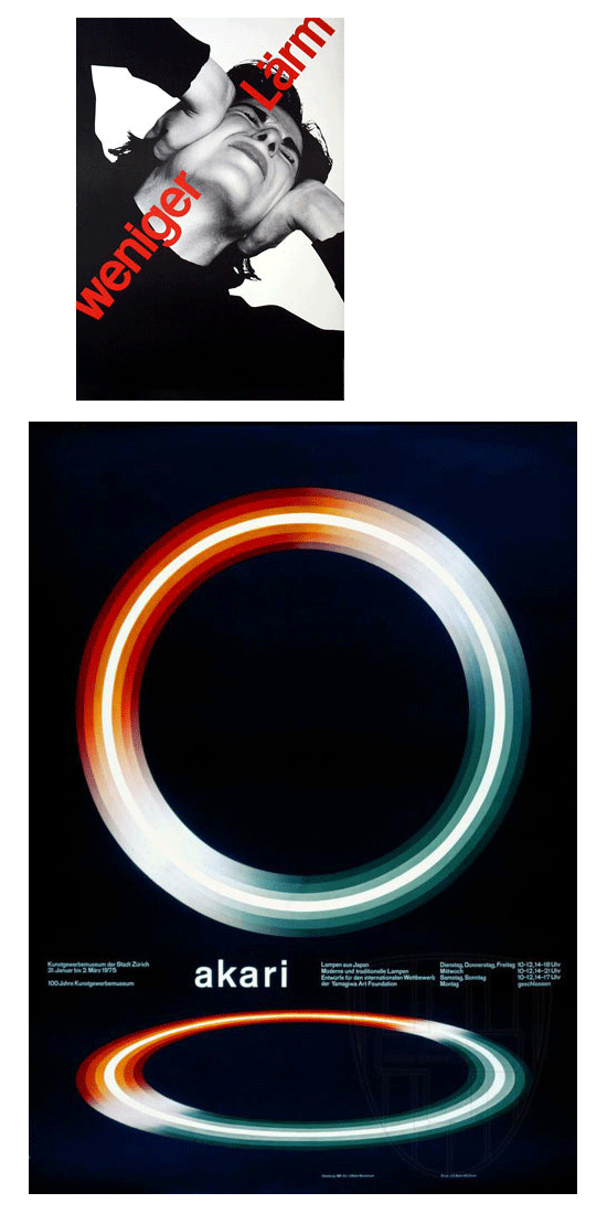
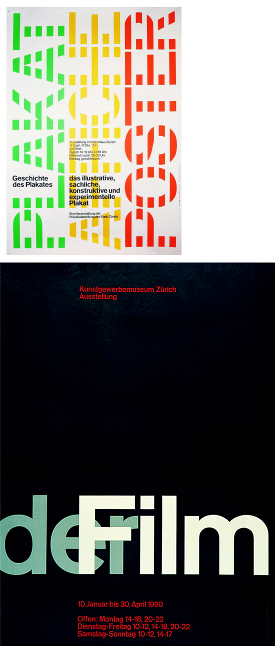
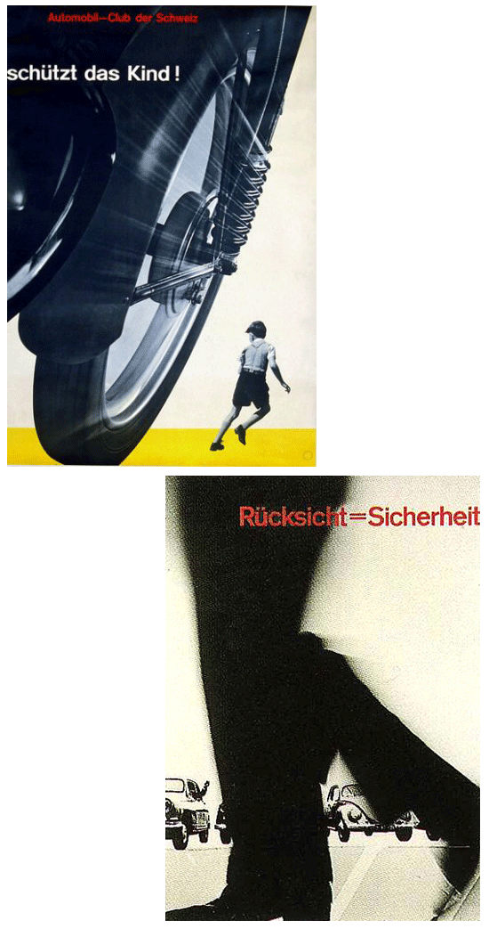
Müller-Brockmann is recognized for his simple designs and his clean use of typography, notably Akzidenz-Grotesk, shapes and colors, which inspires many graphic designers in the 21st century. As with the French posters in the 1890s, Müller-Brockmann and his peers also attempted to attract customers and sell products with bold, simplicity. The posters that served to attract an audience to events, especially music events and museum exhibitions embraced the abstract geometrical shapes the style is noted for; but it is the public service announcement posters from this time period that have been more noted than in many other periods of design. The simple, clean and graphic messages were, as with the music event posters, able to be understood by viewers with different languages.
Whether you deal with print or digital design, the lesson of Müller-Brockmann is for simplicity being more powerful than a mashup of too many elements. In a time of globalization with the web, it’s imperative that the message be simple and instantly understood by those with different languages and cultures. As with his poster designs, who could not get the message, seeing a speeding vehicle careening towards a small child?
Müller-Brockmann published several books, including The Graphic Artist and His Problems and Grid Systems in Graphic Design. These books provide an in-depth analysis of his work practices and philosophies, and provide an excellent insight for graphic designers wishing to learn more about the profession and creative thought. He spent most of his life working and teaching, even into the early 1990s when he toured the US and Canada speaking about his work.
Banner Image by cocoandwifi from Pixabay




Send Comment:
9 Comments:
More than a year ago
very cool to read something about a person from my home country on an international design magazine! :)
More than a year ago
A nice article.
I found it very interesting and inspiring.
I really like Müller-Brockmann's style.
More than a year ago
Thanks, Tim. You are correct. My mistake.
More than a year ago
“a two-dimensional structure made up of a series of intersecting vertical and horizontal axes (sic) used to structure content.
Axes is the correct plural form of axis.
More than a year ago
These designs are unique. They are using alot of overlapping which I have always enjoyed doing. Neat post.
More than a year ago
sehr gut!
More than a year ago
Most refreshing-- especially given the incredible clutter and chaos of so many posters today!
More than a year ago
Wonders, wonders, wonders. Mr. Brockmann is one of the persons who decided my future...
For the reminder:
Universe is on The Grid. Human body is on a grid. So everything you'll do or think is on a grid.
You can even think you're not in it, but it doesn't matter. The Grid will always sustain your work or thinking.
It's not a curse, at the contrary, it's a blessing.
It's like the net of the trapeze artist, it's comforting.
More than a year ago
Thank you for this wonderful article. Usually I'm more technically-oriented, and this article about design is a treasure to me because it opens another perspective. Btw, it would be interesting to know your opinion about Joseph's grid system influence on web design, and it's relation to 960gs (which of both is more suitable for web design?).