There’s no escaping it. Psychology in design is everywhere. It’s why Facebook notifications are red—the color of urgency—to demand our attention. It’s why glossy magazines like Vogue have extra-wide spacing in the typography of their logo. Those teensy gaps signal exclusivity to our subconscious.
As a UX researcher at Jotform, I spend my days trying to understand what makes our users tick. How can we develop a better understanding of people’s needs, habits, behaviors, motives, and emotions?
We’ve been trying to reinvent online forms to address our users’ needs for almost a year. Form-filling is a necessary part of life in a functioning modern society, but let’s face it: It’s not the most exciting of tasks.
That’s why we developed Jotform Cards, a reinvented form that makes the process more friendly, easy, and fun. To do this, we’ve had to examine certain psychological principles and design laws.
And we’ve learned a huge amount in the process…
Our new and improved user experience can be drilled down to three key characteristics: simple, immediate, and aesthetic.
And the psychology is there to back it up. Let me talk you through it.
Simple
“In cognitive psychology, cognitive load refers to the total amount of mental effort being used in the working memory.”
A task with a high cognitive load tends to be confusing and overly-complex, with a steep learning curve; this makes us more likely, as users, to give up.
(After all, we have shorter attention spans than goldfish.)
If a task requires a minimal cognitive load (i.e., it’s simple, straightforward, requires minimal concentration), we tend to stick with it.
At Jotform, we’ve borrowed from the following principles to achieve simplicity:
1. Ockham’s Razor
Ockham’s Razor is a problem-solving principle. Essentially, it says that the simplest explanation is probably the most likely, and the one to go for if there are competing alternatives.
Applied to UX, it’s a warning against over-complicating design, content, or instructions.
This principle chimes with the adage that: “A design isn’t finished when there is nothing more to add, but when there is nothing left to take away.”
Takeaway: Don’t get carried away by the flexibility and power of the web. A product with mountains of functionality, content, and information is likely to be hard to build, use, and maintain.
“Users want to get where they need to be without being sidetracked.”
2. Hick’s Law
Imagine you’re sitting in a restaurant with dozens of items and variations to choose from. You stare at the menu in confusion, trying to narrow your options down. Suddenly the waiter is by your side. “Can we have five more minutes?”
Hick’s Law states that as the number of choices available increases, so does the amount of time and effort it takes to make a decision.
That’s why having a small number of options significantly reduces friction and keeps users more focused on the task at hand.
One question per page layout on Jotform Cards reduces the cognitive loadTakeaway: Minimize choice whenever possible. This includes removing non-critical pages, links, and buttons.
3. Chunking
A longer string of single items is harder to remember than a shorter string of composite items. That’s why people often find it easier to remember telephone numbers in “chunks” rather than one long list of digits.
Chunking is a memory mechanism. If we can arrange information into smaller groups, it’s far easier to for us to process.
Jotform Cards allows you to combine related fields and create sections
Takeaway: “Chunking” information into smaller sections allows users to process the content in front of them and retain as much of it as possible.
4. Flexibility and usability trade-off
It can be tempting to try and plan for every possible scenario to maximize flexibility.
But as the flexibility of a system increases, so does its complexity. Because of this, usability and efficiency are decreased.
Think about the famous Swiss Army Knife. Over time, the makers have added more and more and MORE tools to it. And yes, if you’re at the top of the Himalayas, you’d be happy to find one in your back pocket.
But if you needed to cut a label from your new jumper, are you more likely to reach for a Swiss Army Knife—or for a regular ol’ pair of scissors?
Takeaway: Don’t sacrifice simplicity on the altar of remote possibilities.
Immediate
Who likes to waste time—or, who has time to waste? In our busy age, when other tasks and activities constantly beckon, users want to get where they need to be without being sidetracked.
Keeping this in mind, design strategy at Jotform is wedded to the following principles:
1. Tolerance for error
Human beings make mistakes, and mistakes can be costly. What happens when a user is on the verge of performing a keystroke that may have an unintended (and potentially negative) consequence? Do we just let them get on with it, effectively penalizing them for wandering down the wrong track?
Or do we alert them that they are about to take a step that they might not be meaning to take?
The latter, of course.
And that’s precisely what the design principle Tolerance for Error instructs us to do: Anticipate potential errors/unintended consequences, and flag them up to help users avoid them.
Error feedback and autocomplete feature in Jotform Cards
Takeaway: Arrange information in a way that minimizes potential errors (e.g., by making most commonly-used elements most accessible) and warn users in advance if they’re about to make a mistake.
2. Fitts’s Law
“The time required to move to a target is a function of the target size and distance to the target.”
The smaller and more distant a target on the screen, the longer it will take to move the cursor to a resting position over the target. Applicable for rapid and pointing movements, Fitts’s Law is used to predict the efficiency of movement.
Takeaway: Carefully consider the size and placement of UI elements and website layouts. Small changes can have a big impact.
3. Affordances
The way objects are shaped or formed gives us clues about what they can be used for. A container with a spout invites us to pour liquid; a long strap attached to a bag makes us swing it over our shoulder.
That’s affordance. The term was coined by psychologist J.J. Gibson and popularized by Don Norman in Psychology of Everyday Things.
We shouldn’t have to study the object in detail to figure out what we’re supposed to do with it—the object tells us in an unmediated way. Affordance is successful when the object sets up an expectation and delivers it.
“We shouldn’t have to study the object in detail to figure out what we’re supposed to do with it.”
When it comes to design, affordance is in detail. Clarity will make a big difference to users.
Takeaway: Design with affordance from the user’s perspective in mind. It will increase transparency—and therefore ease and speed—while reducing errors.
Aesthetic
Human beings are—well, human. That means (among other things) that they aren’t always rational. And that’s why all good design will rely to some extent on temptation and illusion.
Here are a couple of things we keep reminding ourselves of at Jotform:
1. Aesthetic-usability effect
We love beauty, of course. But we also think beautiful designs are better—irrespective of whether they are or not.
Yes, design needs to work. It needs to be thoughtful. But it also needs to be attractive.
Jotform Cards with a beautiful video background
A beautiful design not only fosters positive attitudes; it will also give users the impression that an interface is easier to use—and make them more tolerant of design problems.
Part of the role of design is to evoke feelings of affection, loyalty, and patience—all crucial factors in the long-term usability and success of a product.
Takeaway: Brains AND beauty will get you far.
2. Endowed progress effect
What’s your favorite coffee place? Whether it’s Starbucks or your artisanal local café, chances are you’ve got a loyalty card. A loyalty card reflects progress. Every time you have another coffee, you get closer to filling the card. And although you may not realize it, that makes you more likely to stop for a coffee next time.
The Endowed Progress Effect seduces people into thinking that they have a head start, and that they will have to put in less effort to reach their goal. The closer they feel to that goal, the more likely they are to persist.
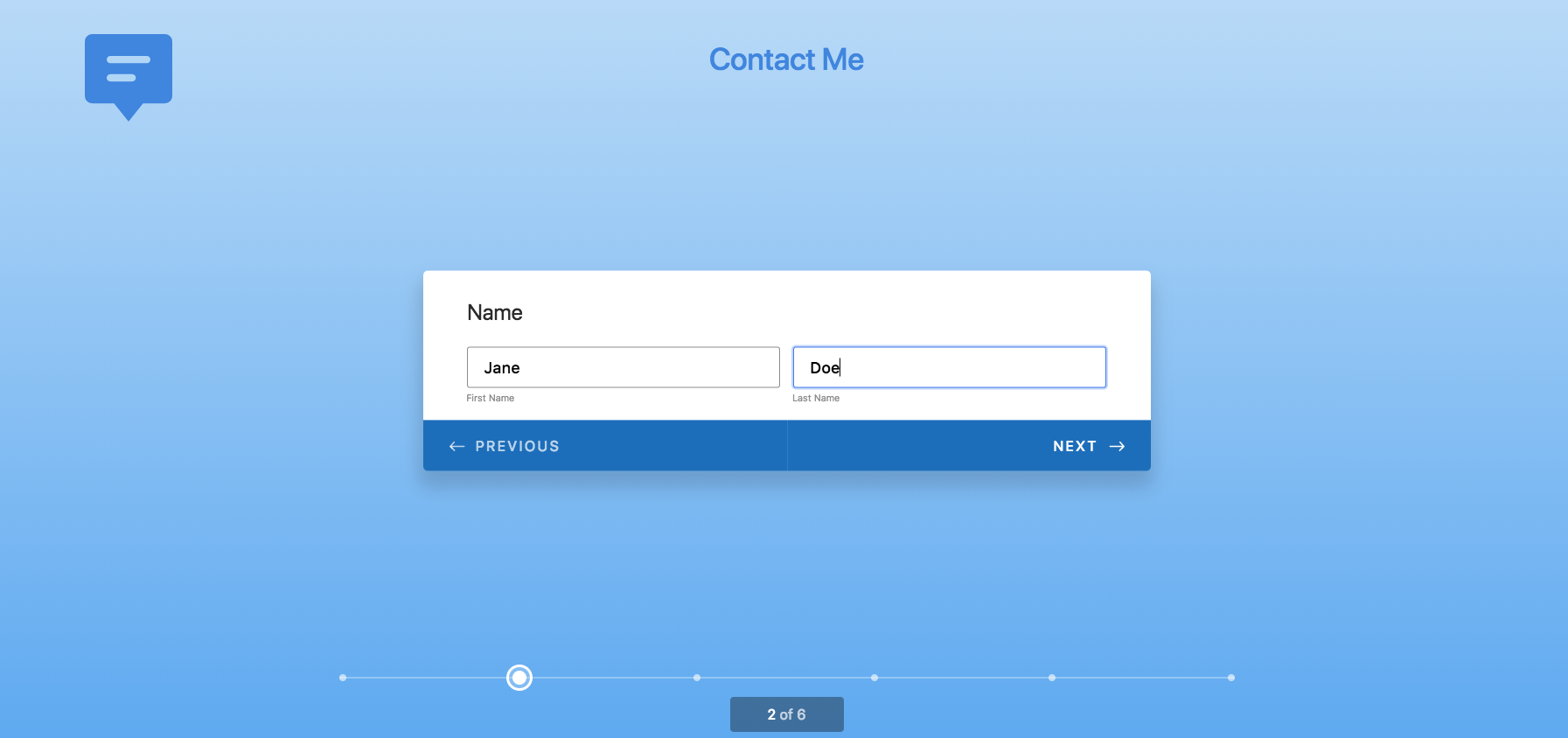
Jotform Cards’ progress bar motivates users
Takeaway: Give your users a head start—real or illusionary. Make their progress visible, reflect back to them that they are moving towards something, and that they are getting closer to their goal.
Originally posted on Invision.com


Send Comment:
2 Comments:
More than a year ago
I’m glad to see that most of the important topics you mentioned in your post are also very useful for my work. Once again thanks for putting out such content.
Thanks and regards
More than a year ago
Great post. Thanks a lot for sharing it!!