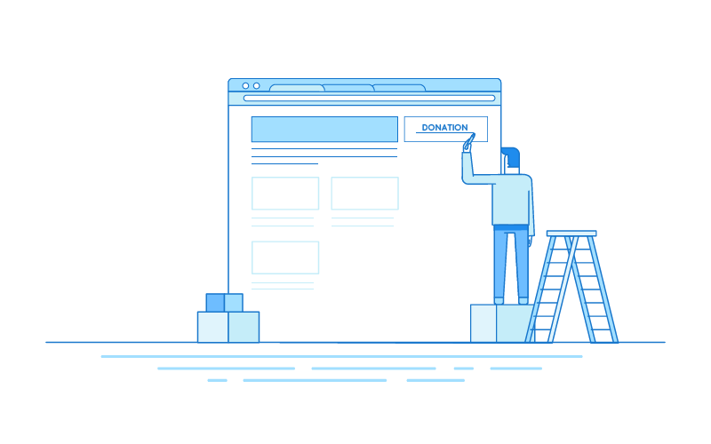
A nonprofit’s website can be the very first introduction to an organization for a potential client or donor — especially because “word of mouth” often occurs digitally through an e-mail, text, or link from a social media platform. Everyone who visits your website is a potential donor. How can you transform as many of these prospects as possible into donors? One of the simplest ways is to ensure people can quickly and easily donate online — and that means having a functional Donate button prominently featured on your website.
One Click Turns Website Visitors into Donors
Today, the average human attention span is about 8 seconds — roughly the same as that of a goldfish.[1] To turn website visitors into donors, it’s crucial to make it as convenient and quick as possible for them to donate, before their attention turns elsewhere.
Your organization’s website needs to motivate the visitor to act — in this case, to donate to the cause. Nonprofits raised $1.19 per website visitor in 2016. The average conversion rate — the percentage of visitors who donated — for a nonprofit was 1.2 percent for the entire website, and 18 percent for the main donation page.[2] Having a Donate button is vital to convert website visitors into donors.
Donate Buttons That Resonate
A Donate button might simply say “Donate” — or it can include other messages, such as “Donate Now,” “Give,” “Support Our Work,” “Help Change Lives,” “Help Us,” “Click Here to Donate,” “Give a Gift Now,” “Make a Difference! Donate” and other calls to action. The message should always be short and simple. Donate buttons on the website homepage should lead directly to the donation landing page, with a web form on that page where people can give immediately.
Jotform’s Donation Box element makes it easy for you to customize your donation button, so you can easily adhere to branding guidelines and create a message that you know will resonate with your donors.
If your nonprofit has branding guidelines, make sure the Donate button adheres to them, since you might need to use a certain color or font. The button should be eye-catching, but not so different from the rest of your website that it looks totally out of place. Make sure the font is easy to read. Don’t make the user scroll down or otherwise hunt for that Donate button — it should be prominently featured on the homepage of your organization’s website.
The Best Page Placement for Donate Buttons
Studies have shown that the human eye tends to read websites in an “F” or “Z” pattern — scanning for important information at or near the top of the site.[3] This means the upper left-hand corner is ideal for a logo, and the upper right-hand corner is an ideal place for a call to action. The bottom right-hand corner is another good placement for a call to action.
Make sure the Donate button is not only on the homepage of your organization’s website. You should include the button prominently on every page, if possible — the header of the site is a great place to put the Donate button so it repeats on every page. Remember, your donors should only have to click once to get to the donation form and give to your organization.
On the donation page itself, use language that continues the call to action, such as “Every gift matters.” Another example is “Your gift/donation will …” followed by the specific goal(s) of the organization, such as “Your gift will feed a hungry child” or “Your donation will provide life-saving medicine.”
Case Studies: The Highest-Grossing Nonprofits’ Donate Buttons
The 10 largest U.S. charities in 2016 were United Way Worldwide, Task Force for Global Health, Feeding America, Salvation Army, YMCA of the USA, St. Jude Children’s Research Hospital, Food for the Poor, Boys & Girls Club of America, Catholic Charities USA, and Goodwill Industries International.[4] All of them have robust websites.
The United Way’s homepage has an orange Donate button in the upper right-hand corner of its website. With one click, users are taken to a donation page with a call to action (“Support Our Work”) and a donation form.
Feeding America features a bright red “Donate Now” button in the upper right-hand corner of the homepage. It flashes green when a visitor hovers over it. Upon clicking through, visitors are taken to a donation page with the message “Help End Hunger Today” and a donation form. The Salvation Army uses the phrase “Help the Salvation Army Save Lives” and St. Jude Children’s Hospital’s donation page says, “Make a donation to end childhood cancer” — a compelling reason to give a gift!
Sense a pattern? These major nonprofits all have a donation button front and center, featuring a simple yet strong call to action on both the homepage and the donation page. Users need to click only once to donate to the organization. Jotform offers several examples of great donate buttons.
How to Create and Install a Donate Button on Your Website
If you have an in-house web team or use a web vendor already, ask them to create a functional Donate button for your site. Provide them with examples of donate buttons you find particularly compelling in both language and design.
If your nonprofit manages its website using a content management system (CMS) such as WordPress, Squarespace, Blogger, or Weebly, check to see if there’s a plugin or widget available. Many plugins allow these websites to display a donation button in the site’s header, and they will work with PayPal Donations, Seamless Donations, and other programs that enable you to accept and process online donations.
Does your nonprofit use a database like Raiser’s Edge or a similar program? Check with your database software provider to see if they offer a Donate button and donation form that is compatible with your existing database. Many offer tools that allow users to create and install donation forms and the donations are integrated with the database.
If none of the above options works for you, you still have several ways to incorporate a donation function and a Donate button into your website. Some of the most popular options include PayPal, Stripe, Donorbox, Network for Good, and Jotform. Many of these companies (including PayPal and Stripe) charge processing fees, but they will offer discounts to nonprofits. Others offer pricing at a variety of levels — some even free for under a certain number of transactions per month.
All these software companies should be able to provide you with the HTML code you need to add the Donate button and any necessary forms to your website. You can copy and paste the code into your site using your website editor.
Once you have a Donate button on your website, you can also use it in emails when sending e-blasts — again, linking directly to your donation page with a form where users can easily give to your organization. It may take a little time and effort, but a thoughtfully created Donate button can pay off for your organization.
- ^ Time, “You Now Have a Shorter Attention Span Than a Goldfish” https://time.com/3858309/attention-spans-goldfish/
- ^ M&R Benchmarks 2017 https://mrbenchmarks.com/
- ^ Creative Bloq, “How the Human Eye Reads a Website https://www.creativebloq.com/ux/how-human-eye-reads-website-111413463
- ^ Forbes, “The Largest U.S. Charities For 2016” https://www.forbes.com/sites/williampbarrett/2016/12/14/the-largest-u-s-charities-for-2016/#2cc43a594abb


Send Comment:
5 Comments:
More than a year ago
Hello,
I am the founder and chairman of a nonprofit organization based in Toronto, Canada with a mandate of Community Development by providing excellent education to underprivileged kids from Rusaka; a rural remote area in Burundi Central East Africa. We routinely organize fundraising through different platforms/crowdfunding like GoFundMe, social media, and door to door. After multiple discussions, we deem the organization may be better serve adding a donate button on its website for a more consistent system and an option for whomever desire to become a recurring donor.
Would you be so kind to provide us direction on how to setup the button, requirements and cost.
Much appreciated!
Olivier Ndikumana
More than a year ago
Did you know you can collect payments with your forms?
Jotform provides a variety of payment processing options including Square, PayPal, Stripe, Authorize.Net. It's easy to sell products, subscriptions, or collect donations
I got mail what should I do now
Please revert me in mail
More than a year ago
Hi,
I am chairmen of our church and manage our First Congregational Church Web Site and would like to add a donation button. This is a WebPro wed page. Not sure what has to be done to do this.
Please advise?
Thanks
Bill
More than a year ago
Dear Sir, Greetings of the day. I am pastor of a church in India. Because of lockdown I started online church service, sharing the Gospel of Lord Jesus Christ. So I have Dashnexpages.com as platform to give out Bible Study online. Since this is a church ministry a non-profit organization, I invested USD17 to get one website and one e-commerce stores. But it is very necessary to collect donations, tithes and offerings so that me and my family could live decently. Moreover now I am 69 years old and have spent all my life sitting at the feet of Jesus as Mary the sister of Martha did listening to the sweet voice of Jesus. Now I am ready to give the treasure that the Lord has stuffed in me to the other people in the world so that they may have life in abundance and fullness of joy. Because for example the Lord has fulfilled for me the promise of Ecclesiastes 5:20, "But he shall not dwell unduly all the days of his life. Because God will keep him busy with the joy in his heart." (NKJV)
So I request you to kindly offer me your HTML code freely so the I could place a 'Give Now' button on my website which is yet to be published. Arvind
More than a year ago
I want PayPal donate button.